


Sangju dried persimmon brand


Sangju dried persimmon brand (Cheonyeongosu)
Character
-
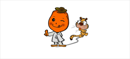
Character Everyone must know the story of "The Dried Persimmons and the Tiger" where the tiger ran away in fear of dried persimmons. The goal is to maximize the promotional effect by developing this well-known story. The tiger with its round eyes seems to be really scared, and the dried persimmon character with a bright and friendly expression will be easily approach people and double the fun when combined with the story.
-
Character Logotype/Grid The character logotype is one of the key elements that form the core image integration of Sangju dried persimmons with the character. It was designed in consideration of unity and combination with the character, so it cannot be arbitrarily modified.
-
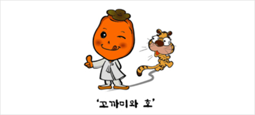
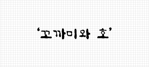
Character signature This is the signature rule when the character and the logotype are used together.
Everyone must know the story of "The Dried Persimmons and the Tiger" where the tiger ran away in fear of dried persimmons.
The goal is to maximize the promotional effect by developing this well-known story.
The tiger with its round eyes seems to be really scared, and the dried persimmon character with a bright and friendly expression will be easily approach people and double the fun when combined with the story.
Character color
-

Character color
BI
Definition
The BI (brand identity) of Sangju dried persimmons is a basic element of the manual and is a representative symbol that is the key to all visual communication that expresses the image of Sangju dried persimmons.
-
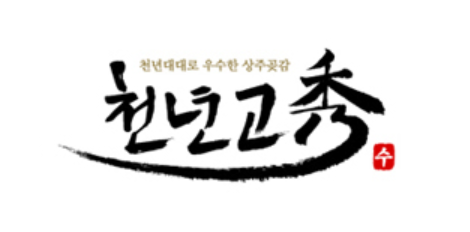
DESIGN CONCEPT The design concept is based on the meaning of 'cheonyeongosu,’ which symbolizes the best Sangju dried persimmons that have been passed down over a millenium. Calligraphy was used to convey the image of a luxury brand and traditional power, and by using long strokes for the Chinese character 'su,' it contains the intention behind the development of Sangju dried persimmons: to maintain the thousand-year tradition with the best quality and dignity.
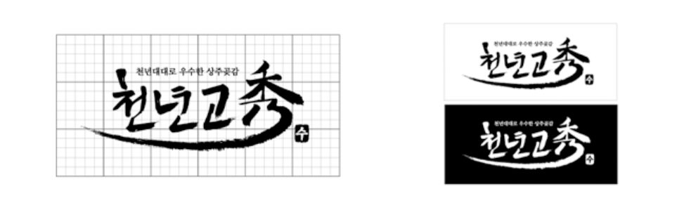
Grid/positive·negative
- Grid/positive·negative
- The BI (brand identity) of Sangju dried persimmons must be reproduced in an accurate way to maintain visual homogeneity depending on the conditions and situations in which it is used. When using the BI of Sangju dried persimmons, refer to the grid regulations presented below.
- Positive/Negative
- As a rule, the BI should be a positive image on a white background as shown below, but if it is used on a black or dark background color, the BI should be clearly displayed as shown below.
-
DESIGN CONCEPT The design concept is based on the meaning of 'cheonyeongosu,’ which symbolizes the best Sangju dried persimmons that have been passed down over a millenium. Calligraphy was used to convey the image of a luxury brand and traditional power, and by using long strokes for the Chinese character 'su,' it contains the intention behind the development of Sangju dried persimmons: to maintain the thousand-year tradition with the best quality and dignity.